Animation Synoptic - Joy Proxy
- 2574267
- Jan 17, 2022
- 26 min read
Updated: May 26, 2022
We were tasked with creating a short trailer for an animated series.
Before starting this project, there was a lot of important infomation we needed to make sure we knew. I read through the brief and picked out certain parts that I needed to know. These included:
Film in 16:9 aspect ratio, 1080p x 720p, 25fps, use H264 video codec, AAC-LC sound codec.
The film needs to be 30-40 seconds long.
Animation should show examples of the 12 principles of animation.
We get to choose what the trailer is about, but we have to make it excite the audience and we are aiming to sell our idea (hypothetically sell).
First ideas
I had to come up with an idea for my animation. I needed to think of a show I could portray well in 30-40 seconds, something that can be summed up well within that time. I came up with three different ideas to start with.
Prison Escape
A group of prisoners attempt to escape, prisoners can be innocent or guilty but I'm leaning towards them being innocent so they have more determination to escape, and this will make the audience want them to escape. I’m planning for the prison escape trailer to be very suspenseful and have the viewers on the edge of their seats. I also need to inform the viewers of the prisoner’s personalities and their motivations. Some camera angles I'd like to use are big close ups and zooms, I want to really show the expressions of the characters when they discover shocking secrets about the prison. The trailer would probably end after the big reveal, so the viewers are left wanting to watch more.


I made a moodboard of character inspirations. These inspirations can be for either outfits or personality.

Alien Invasion
Some sort of alien race comes to earth. I'd like to put a twist on this idea, however. What if humans were the ones invading and we got to see us from the alien's perspective?
If I wanted the viewers to like and sympathize with the aliens, the logical move would be to personify the aliens and have their design give of human characteristics and personify the aliens. However, I want the audience to sympathize with an alien that looks abnormal. Like my last idea, I made a moodboard for character designs.

I made a moodboard for the alien world too.

The cursed chef
A story about a chef whose restaurant isn’t getting enough customers to stay open. He meets a mysterious being who grants him one wish after the chef saved his life, the chef wishes people would be more interested in his food. The next day he finds that when he cooks a meal it comes alive. At first the customers love it but it starts to get chaotic after a while so the chef tries to find the mysterious being to reverse the wish and the food tries to stop him so the chef must fight back. With this idea I also made a moodboard for restaurants since that would be a main location.

Out of these three ideas, my favourite was the third idea which was the cursed chef. I think it had the most potential and a lot of creativity could be put into this trailer with character designs and locations.
Gantt chart
I created a Gantt chart in Excel to plan out a timeline of work. This was mostly estimated since I can’t know for sure how quickly my me and my group would be able to complete certain tasks. I wanted to use it as a rough outline of the timeline.

Legal and Ethical considerations
When making the animation we had to think about legal and ethical things that could be in our animation and whether we should include them. Listing scenes and details that could be considered ethical or legal issues, this would also help us determine an age rating.
Ethical
Gang fight scene - A scene that takes place where the gang attacks our main character Joy. Joy does fight back but ultimately loses the fight. Some viewers may find this scene hard to watch since it would be a brutal fight. The fact the fight is between a group of men and 1 woman may make some women uncomfortable as well and even unsafe since issues like this occur in real life. We had to consider how brutal we want the scene to be as well, for example if we wanted to include the use of blood. In a real scenario there would be a lot of blood, however we can get away with having no blood shown like other media does.
Use of Gun and knives - The use of guns and knives is a tricky subject. They are used in a lot of media, mostly media with a higher age rating. However that are cases where creators get away with using weapons one example being most games above the age rating of 12 such as Fortnite and Overwatch. One technique is to not use real guns but instead laser guns. Also removing blood from getting shot or stabbed also can reduce the age rating. Some games like to add effects instead of blood. For example, in the game 'Persona 5', there is an attack which causes the enemy's silhouette to spew out blood. However, when the main character from Persona 5 got added to the game 'Super Smash Bros. Ultimate' as DLC, the same attack was preformed but changed slightly. Instead of spewing out blood, the enemy will spew out sparkles instead.
Footage on the left is from 'Super Smash Bros. Ultimate' and footage on the right is from 'Persona 5'

I think this is a good idea and a smart way to censor something without making it look off.
A not so great and less clever example of censoring can be seen in 'JoJo's Bizarre Adventure'. The picture below depicts a 17 year old smoking which is obviously not legal. In certain broadcasts or DVDs, the smoking is censored by just a huge black shadow. This isn't really a clever or creative way of censoring it, however there isn't much else they could do to censor it apart from cut all the censored scenes entirely. They use the same black shadow to censor things like gore. Overall this is a poor way to censor since when watching, the viewers will notice straight away and will most likely be taken out of the immersion of the story.

When blood is shown, for some broadcasts the blood is reduced to avoid it looking more violent and graphic.

With all the content we show in our animation, we have to consider the viewers reactions. Some viewers may have had traumatic pasts and we don't want to make them think about these again.
Legal
Age rating - Previously, I spoke about what is predicted to be included in our animation. So now we have to decide the appropriate age rating. For the trailer alone we can get away with rating it a 12. However, our team have discussed that if there were to be a full show then it would be rated an 18.
Illegal deals - In the animation, Joy is seen making a deal with a gang. While we won't show what they are dealing with, it will still be classed as illegal. It could be drugs, weapons, or anything that can be used to harm others. Later, Joy gets arrested out of suspicion for these crimes.
Risk Assessment
Our group came together to discuss some potential risks in the room that we would be working in. I have listed them into a table below.

Market Research
Market research was a bit of a difficult task since most streaming services don't share much about payments. After looking at some sources I got some information which I rounded to get an estimate of how much budget we would get and how much we would get paid.
Average cost that Netflix pays per 12-episode season of a live action series - $50-$60 million. For an indie studio they would probably get paid less. So, let's say $40 million. Netflix would pay $3333333 per episode.
Usually have a budget of $300million-$500million.
When Netflix releases a series, they will mostly always do it in big batches instead of airing an episode per week, this brings less attention to the series since when released weekly there will be more hype for people to talk about every week and there is more chance of the series to stay trending. This is easy to distinguish as it will be labelled as a Netflix original.
Monthly Budget
Me and my group were tasked with creating a hypothetical monthly budget list. This was hypothetical since we didn't have to pay the prices because we are doing this project in college. While we aren't paying these, the prices are still real.
First we listed rent and building supplies. We all decided to do one costed item each, so someone would choose phone lines and someone else would do gas. We looked at providers of these items to see their prices. We also had to calculate the prices for each month since not all prices were told in months, some were payed by yearly.

We wouldn't need to pay for all of these since some people might not get the bus at all but we listed the prices just incase.


Moodboards
I started making mood boards to gather some ideas and references for character designs, character personalities and landscape/scenes.
The first one I made was a mood board for the main character Joy Proxy. To do this I started to think of characters who reminded me of her. From discussing with my group, I got the idea that Joy Proxy was a strong, confident, smug and rebellious. Me and my group also discussed some colour schemes. We collectively chose a purple and green colour for things like her hair and possibly clothing. We went with purple and green because the colour scheme felt futuristic. For the clothing we wanted to use leather on some parts like leather trousers and a leather jacket.

The second mood board I made was for the lawyer, Legacy Silicon. The group decided we wanted a confident, comedic, smart and calm. Legacy Silicon’s backstory is that he is a robot made by a company, he was designed to be a lawyer, but he has a mind of his own. He is designed to look like a middle-aged man in a suit with bits of his robotic side showing, some being from injuries from past clients he has dealt with. Some of the characters I chose as references may not be lawyers themselves however I felt that their personality or design made them seem like a suitable choice for reference. Characters like Gustavo Fring from Breaking bad who are intimidating yet calm and collective. I chose Matt Murdock (Daredevil) as a reference too since he is a lawyer but also quite a smug and comedic character.

I made a mood board for robotic guards who were mostly background characters. I was aiming for masked cybernetic buff design so I looked for not just robotic characters but also the body shape so I used celebrities like The Rock and John Cena as reference.

The last moodboard I made was for the gang members. I wanted them to look rough and intimidating. Some of the characters I put on my moodboard have the right design for the gang members were wanting to create, however some don't have the personality. Likewise some characters don't have the correct design were looking for but do share the personality we want.

We needed an idea of alley ways which one of our main scenes would take place. We wanted a dark, intimidating, dangerous, rundown and futuristic alley, the scene would take place at night which was one factor we needed to take into consideration. I thought of adding a lot of neon lights to give emphasize that this scene takes place in the future. Some of the images chosen would be used for camera angles as well so we all have a good idea of what we are trying to achieve.

Rough Storyboards
While we were discussing the alley scene, I created a very quick and rough storyboard just to get my thoughts and ideas across to the group. The first panel was a flashback where Joy Proxy walks up to a gang. She plans to give them an item that they requested from her. The gang would be grouped on a corner building, and the scene would be quite empty in terms of people since most people do not dare go down this alley due to gangs overrunning the place.

The next rough storyboard I drew was to show my group what camera angle I was imagining another scene to look like. This scene takes place after when Joy gets attacked by the gang members. She has fallen to the floor and lies there injured. I had a vision of the camera slowly zooming into her face and more specifically her eye. As this scene happens you hear the gang members shouting and running off to avoid being caught and you also see flashing red and blue lights to signify the police turning up. Like I said this was a very rough storyboard and wasn't the final storyboard for this scene.

The final rough storyboard I drew takes place in between the two previous rough storyboards. In this one I wanted to demonstrate the camera being over Joy’s shoulder when she is speaking to the gang member. This was also a chance to create a rough design for the gang member as well.

Storyboards
The first storyboard I made was for a scene near the start of the trailer. The scene starts with a back view of Legacy Silicon walking down a hallway. It then cuts to a side view of him walking down the same hallway, from the side view we wanted to make sure one side of his face remains a mystery to the view’s eyes. We then cut to a door with two guards stood outside, Legacy walks up to them and makes a bit of conversation before entering the door which then cuts to the next scene after this storyboard.
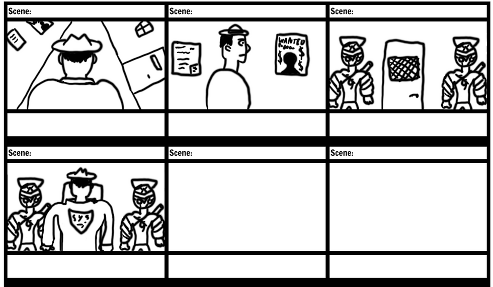
I also created a animatic for this storyboard to further demostrate what happens in this scene without fully making a finished animation. The animatic also helps show how the scene will sound excluding voice acting due to not having preformed it yet.
The following storyboards take place after Legacy has entered the interrogation room, he sits down facing Joy. There are action scenes in-between these storyboards which are meant to be flashbacks. I have added parts from the script to the storyboard to show what the characters are saying and doing.
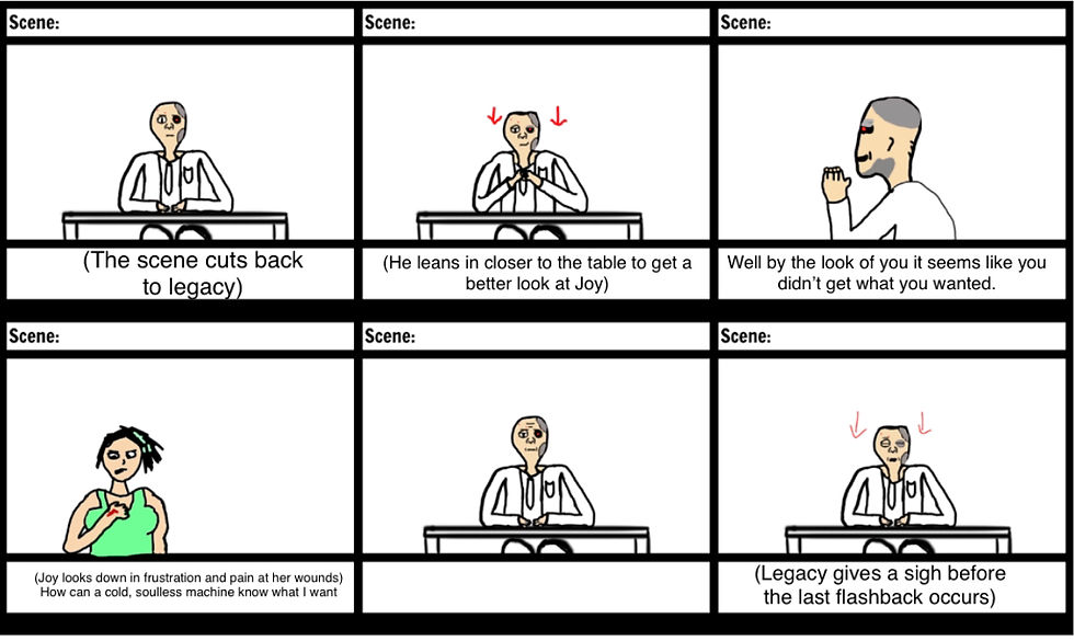
This storyboard should be the last scene we have before ending and cutting to a title. We decided to end it on Joy saying "When do we start?" to give suspense and excitement.

Concept Art
My concept art for Legacy was mostly focused on his face rather than his outfit. I did do some basic outfit designs for him to start of with but it was not as detailed as his face which I drew after. I did a couple different basic designs of him without his hate on, one with hair, one with hair on the side but a bald top and the last was the same as the previous design except his bald head was metal.

After his outfit I started to draw his face. I originally started sketching just a basic male face.

Adding some more details like eyes, nose, ears and mouth.

At this stage I started to add some robotic features to his face like parts of his skin coming off to reveal metal underneath. As well as a metal plate on top of his head to cover one of his eyes. The eye is meant to glow red.

One thing I added that I should speak about is the little logo on his forehead. This is the company who made him and their logo resembles a police badge. It spells S.T.P which stands for Security.Technology.Protection. Originally it was S.T.L with the L standing for Law.

Once my pencil drawing was completed, I took my drawing into Krita and started drawing a digital version with colours.

I enjoyed learning how to draw facial features without just using lines and instead using colour like the wrinkles and reflections from his metal bits on his face. One thing I would improve on would be the red glowing eye, the way I did this didn’t look like a glow and I was unable to go back and change it. However, later on I had to draw another glowing light on his face which was green, and I was able to learn a better technique which made the glow look much better.

Here is the final version of the concept art for Legacy Silicon’s face. I learnt a lot of new techniques while drawing this and I am proud of how the final result looked. I am impressed with the blue eye I drew since I usually find these the hardest.

I went through the same process as Legacy by starting by sketching and then taking it into Krita to draw digitally. Joy was a lot more hard but also more fun to draw since I was experimenting with materials and anatomy.

Starting to add colours and shading. I had to decide a main colour scheme, I had the idea of making the colours bright and neon. Green and purple was my first idea which I think looked the most fitting.

To fit the chosen colour scheme, I made her nails, lips and hair highlights green as well as her eyes. I made her shirt green, but I chose not to make it bright since it would not look very pleasing to the eye if everything was a bright green. I tried to make the trousers look a bit purple but since they were meant to be leather, I made them a dark purple instead.

After I was mostly finished, I decided to experiment with some alternate colour schemes. I only changed the colour of the lips since I had spoken with my team about what they wanted changing and lip colour was the main change that came up. I still stuck to the idea of having bright neon colours. First, I changed the green to purple and showed my team for their opinions.

Next, I made the lips blue and sent it over again.

Overall, my team had a liking to the purple lips so we decided this to be the main colour for her lips.Everyone was happy with how she looked so we decided that this was the main design.

I received some feedback from a university art lecturer when they looked at some of my work, this concept art being one of them. They said that the things I could improve on is my anatomy and how the body is shaped. More feedback that they gave me was the materials, they said that they all kind of looked the same and that I should make for example leather look more like leather and cloth look more like cloth.
Later on I added a jacket which I think gives a whole different and better look to her outfit. This was a request from the whole team including myself, we thought she felt a bit to plain in just a tank top so we gave her another layer which fit with her outfit. Only thing I would change is probably the lenght of the jackets arms and make them longer.

Environment art
I did a small sketch of how I think the interrogation room should look from a certain angle. This angle is meant to be from a security camera in the room so we would get a perspective of the people watching from security footage. The design of the table and chairs was rough too, in this sketch I was just aiming to show a perspective rather than a design of the room itself and the items in the room.

Modelling and Texturing
I started the modelling stage with something pretty basic which was a carboard box for the alley scene.
Unwrapping the box was a bit difficult due to the way the boxes mesh got decimated and all the vertices got placed everywhere. However when applying the textures in Substance Painter, it looked quite good. I added some green rust to make it look like the box was moldy since it had been in a dirty alley way.

As for a first model and texture for this project, I'm very happy with this box. One thing I regret is using too many polys, I cut them down with the decimate tool but this ended up making the unwrapping stage a lot harder.

Next I modelled some futuristic handcuffs. I sent this model over to Benjamin to texture. However I gave him some direction with what colours to use and materials.

After the cuffs I made a rat for the alley scene, I wanted it to be fairly low poly but still have the qualities of a rat. The rat will not have much screen time so the model and textures didn't require a lot of attention and time.

The rat was quite difficult to unwrap since the mesh was quite all over the place with its vertices. My main aim was to just separate the fur and skin. Since the rat wasn't on screen much I'm not going to make an incredibly good unwrap for a model that doesn't need it.

I tried to make the rat look fury with using textures instead of adding hair modifiers.

The most challenging model so far for me was the tire, these required a lot of time and attention but came out just how I wanted. I used the bevel tool a lot in this model to create the ridges in the tire. One thing I would change would be the poly count. If I were to re-do the tire I would try and cut down on the amount of polys I used. I added some rust to the middle metal part of the tire to keep up the design of looking old since the tire model is going to be used with the old run down cars rather than the futuristic cars.

The tire unwrap was fairly simple, I just mostly needed to focus on separating the metal centre from the rubber on the outside.

I added rust to the metal centre for more detail. One thing I would change about this texture is the black rubber, it would've been impressive to add little bumps as apart of the material. However this would be take too much time and effort for something quite small.

Along with the tires, I modelled the cars. At first I just modelled a old ruined car for the alley scene. Then I made some edits to the old car to make a future car that would be seen flying in the background of the city. I made two different textures for each kind of car.
Here is the original design for the car, the textures would be able to show whether its old or not. The car was designed to fit one person.

I spent a lot of time on the car unwrap only to end up with a very simple unwrap. At first I thought about marking seams close to the wheel hole and window holes but realised this wasn't really needed. If I was to make the textures more detailed then I would add these seams.

The first texture I made was a pretty standard blue rust car. This was to be used in the rundown alley scene. I wanted multiple cars to add a bit more realism so not all cars are exactly the same.

The second one I prefer more since I decided to add details like spray paint. These cars would be used during the run-down city scene where the gang members are located. I wanted to emphasise that this part of the city was run by them rather than a government. This area of the city is a dangerous and cruel place so making it look rough helped prove this rather than having scary people in a happy and clean area. The spray pain I wanted to randomize as much as possible with different logos and words. To do this I had to learn how to use stencils in Substance Painter.

After the old car was complete, I thought rather than making a whole new model for the future car I could just slightly tweak the model I already have to give it new parts. I had to remember that the main thing that would determine whether the car looks old or not would be the textures so I didn’t change too much about the original design of the car model. Since this car would be flying, it would make sense for it to be more aerodynamic like a plane so I added airfoils (wings) to the side. I made the front more sharp too.

I wanted the future cars to be very shiny since rich cars would be everywhere in the city. I also used the paint tool in Substance Painter to add a lightning bolt design on the side. To make the material so shiny, I turned down the roughness and turned up the metallic as well as the specular.

The second design I used a pre-made material and edited the colours. After completing both future car textures I sent them over to Joe who was in charge of the city scene. He placed them in the background to fly past the window of the interrogation scene.

The next model I had modelled before but a long time ago, so it was fun to compare one of my first model skills to how I can model now. The model was a knife. At first I modelled the knife to be low-poly and then add a subdivision modifier. However, after discussing with my group we thought a low-poly knife would be better since the knife will be small and not have much screen time. I used this knife to learn how to bake textures as well since I had not much knowledge on this and why people do it.

The knife textures weren’t too detailed, I added rust to make it look like dried blood to indicate that the knife has been used fairly recently. I added a bit of green rust to make it look dirty and mouldy. I used a grainy plastic texture for the knife handle.

I wanted to start making some bigger models for the scenes. I started with the alley walls. The model itself was very basic just being a big rectangle. However with textures it looks much more than that. This was my first design which looked good but seemed too basic.

My second design felt even more clean which isn't what I was after.

This is the wall I ended up using, however I made some more edits to the final version to improve the look of it.

I added some green mold which was very fitting for a run down alleyway, I wanted the environment to be dirty and not very nice to look at. Then later I added some graffiti designs to show this alley was still be inhabited.

This is my final texture. The shadows are above the bricks for some reason so this is an issue I need to fix. However when trying to, I unfortunately could not find any solutions. The graffiti used are both stencils from Substance Painter.

Since there is going to be multiple walls, I needed another texture since I can’t repeat the graffiti otherwise it would look strange. So, I made another texture with other graffiti designs.

The model of the wall was the most basic model out of them all, it is just a square that has been altered to form a cuboid shape.

Along with the alley, I made the alley floor. Like the wall, I came up with a couple designs first, one looked like a road until I realise they would usually have road markings in an alleyway. Here was my first design which felt a lot more clean than how an actual alley would look. The unwrap for the floor was pretty much the same as the walls unwrap since they were basically the same mesh.

My final floor was very gritty and had bits of green on it to look dirty. I eventually want to add bits of water like little puddles.

To make the puddles on the floor I used Geometry and Noise Textures in the shading tab of Blender. It took a lot of messing around and experiment to make it look how I wanted. I didn’t want the puddles to big or too small so I was constantly changing the scale on things like the Colour ramp.

When I was making the graffiti on the walls I thought about adding some spray cans to the scene. Firstly I made a red one. I added tiny details that will not be noticed in the animation like hazard signs and a bit of paint dripping out of the spray hole.

On the back of the can I added a red hand print for detail to show people have been using it.

I used the same model to make a purple can too. I changed the designs to show that these were two different colours and looked like real products.

The unwrap for the spray can was pretty simple and easy to make since it mostly consisted of circles.

When I started to layout the walls together I realised that the mold would clip off. To overcome this situation I had an idea of creating a pipe to go on top to make it look like the mold was coming from under the pipe.


The pipe unwrap seemed a bit messy but it ended up working well with the textures I used.

Next I created a larger building to try and fill out the scene a bit more. However it felt empty at first so I decided to add some ladders and platforms to the side of it.

Here is the first textured version of the ladders.

When sending the files to myself to work from home the textures messed up so I had to remake them. Here are the new textures.

The ladder unwrap was very difficult to make, especially since the model itself was a bit difficult too. This could be a reason why the textures didn’t work too well but I’m not too sure if it is.

While I didn't make this model, I was tasked with making the textures. I made it look old and mossy.

After the environment was finished I started to think about adding characters. My group realised we probably not have enough time to model and texture our own characters so at first we tried using softwares like makehuman however those didn't work how we wanted so I found a model for the gang members on sketchfab.

We realised we didn't want all gang members to look the same so to avoid having to find more models that may have different styles to each other which would be inconsistent, instead we recoloured the textures in photoshop. I had never done this before so it was a creative way to make new textures by using existing ones. For the gang leader I drew a red eye logo on his shirt and gave him a red mask to make him stand out more.

The characters were already rigged however the rigs were hard to use and I thought I could make a better one. Also I wanted to make a rig using Inverse Kinematics. Here is the rig I made for each character. I tried copying and pasting them to make it quicker however this caused more issues and took longer so I made 4 rigs in total (for all 3 gang members and Joy).

I made the mouth rig mostly using weight painting. It is a fairly simple mouth rig since all it does is open and close but we weren't trying to achieve something amazing, just something to make it look like they could at least talk.

When animating I had to think what I wanted the gang members to do. I had a rough idea which was to have them huddled together and then turn around to face Joy as she approached them. The gang leader would be the one in front to show his dominance and that he is clearly the one in charge. I wanted one gang member to use the environment so I had one sat on a car at the start of his animation and then for him to jump off and walk over. The first one I animated was the one in plain black clothes. I wanted him to just turn and cross his arms to help me get used to animating. Next I moved onto the green dressed one who jumps off the car. I finally finished with the leader and made him turn around, I wanted him to be menacing and be turnt around to face Joy.

Here is a closer look at the green gang member walking. I wanted to give him a kind of lazy walk that seemed sneaky.

Like the gang members, we got the model for Joy online instead of making it ourselves. I rigged her the same as I did for the gang members. The rig is basically the same as the gang members but just altered a bit to fit her proportions.

Joy's first animation is her walking over to the gang. This is the first rough animation of her walking. I've learnt that making animations like walking is a lot easier with inverse kinematics.

I carried on making Joy's walking animation until she got close enough to the gang members. Once she walks over she stands. I gave her a hand on waist pose so she looked confident.

As Joy walks over, the gang leader asks: "you got the device". Joy then pulls out a glowing object from her pocket. I animated the gang leader to point at Joy as he asks the question and I also animated her grabbing the device and briefly putting it back into her pocket. In the final animation you'll be able to see a slight glow from her hand. However, here you can just see her hand move.

Here is a better and closer angle of the new hand animations for the gang leader and Joy.
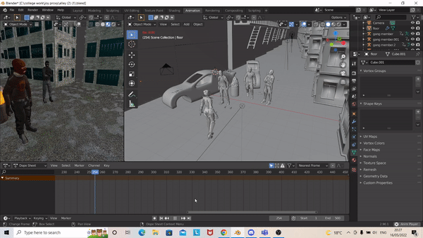
Once I had advanced with Joy and the gang leaders animations, I needed to think of what the background gang members would be doing. For one I decided to have him punch his hand in a threatening way while looking at Joy. He also turns to the other gang member and nods his head.

Like the green dressed gang member, the black dressed gang member also needed some more animations while he stands in the background. I didn't want to make him do too much since I wanted to have him stood watching and observing. He stands with his arms crossed and eventually uncrosses them before Joy gets shot. He also nods at the green dressed member. While he looks still, he does have a few minor animations like breathing and tilting his head every so often. As Joy approaches the gang, both members follow her with their eyes, since I didn’t add an eye rig I just made their heads rotate to face her as she moved closer so it still looked like they were looking at her.

When Joy gets shot, I added a small animation for the two gang members. As the gun shoots you can see the members slightly jump. I wanted to make them be a bit startled by the gun shot. This indicates that maybe the gang members didn’t see it coming and that it was unlike their boss to do such a thing. I like to think this opens up a lot of theories to who the boss really is and if it was the plan all along for Joy to be shot.

A closer look at the gun being shot. If I were to go into lots of detail with the gun animation, I would’ve added an animation where the guns trigger and barrel moves.

When being shot, I wanted Joy to stagger for a bit before she falls backwards onto the ground. This makes her being shot more dramatic. I had to add an impact animation for both when she gets shot and when she hits the floor. One example of the impact animation is her arms, they look like they bounce as she hits the floor. I also added a little animation where the gang leader points his gun in the air and starts to shoot. I’m not planning on this being in the final version but I thought I would make it anyway.

Now that all the characters animations were complete, I looked for more to do. I looked around my scene and realised I needed to animate the rat. I had the idea for it to jump out of a box at first. However, when looking at the spray cans I realised it would be a cool detail to have the spray can fall over and roll. So, I thought to have the rat hit the spray can and run away into the dark. I studied real cans for reference to see how a can rolls since I wanted it to look accurate.

I needed to add the gun Kacper modelled into the gang leader’s hand. To do this I fixed the gun to the leader’s hand bone in the rig. I used Ctrl P and then clicked bone while in pose mode.

The last thing I needed to do for my scene now was render, and to render I needed cameras. I added two cameras in total so when I were to render, I’d only have to render once instead of having to make a new render each time I wanted the camera to switch. I thought about the shots from Kacper’s storyboard for this scene and used them but also slightly altered them to fit with my animations. I tried to get a variation of different shots. It was a challenge to get to show some animations since in some shots they weren’t visible. For example, the green dressed members punching animation can’t really be seen in the final render.

Voice Acting
While I can’t really show much in terms of voice acting, I thought I would mention that I voiced the gang leader in the final animation. Most of my group auditioned for different roles in the series so we all chose who we thought suited each character best and used their voices. I also got some recordings from a friend who isn’t in the group to voice Joy, while we didn’t end up using it due to microphone quality, it was still a good voice in my opinion.
Extra captures
Here are some extra captures I got from certain angles.


Conclusion
To conclude I am very pleased with my contribution to this project. I believe my work was quite high quality and my effort towards this project is valid evidence of that. I tried to help others whenever I could and would sometimes complete some tasks for others in my group. However, I didn’t need to help much since my group preformed as great as I did. It was comforting to know that if I were to have any issues with some work I could either get some help and advice or just give someone else a task if they are better in that area of work. My only complaint I had with my group is communication. When it comes to a group project, communication is the key to succeeding. Especially with an animation or games project. The group needs to keep constantly making sure work is up to date, deadlines are met, members are feeling good enough to work and most importantly to support each other. Once groups fall apart, the project soon follows and falls apart too. Luckily for our group we didn’t have too many issues but like I said, communication was everyone’s weak spot. While most of the group was fine, there was one member who was lacking behind and not keeping up with everyone. While this issue has been sorted now, it definitely slowed me and the rest of the members down since work we gave the member was not being complete and we were having to deal with their problems instead of carrying on with our own work. This sounds like a big issue however we weren’t too affected by these issues thankfully. we were still able to complete the project on time and make it good quality. I'm very pleased with the final render, it really feels like a real trailer and it makes me want to watch the show if it were real.
Final Animation
After 5 months, the final animation is complete. After we rendered our clips, we realised that we had gone over the 30-40 second time limit. To make sure we were within that time limit, we made a shortened trailer and a long version that contained all the animation, sort of like a directors cut. The shortened version is 45 seconds long, however this is only due to the title screen being 5 seconds. If we wanted to be within the 40 seconds, then we could remove the title screen. But we think its okay because our actual animation is 40 seconds long on its own.
Full Trailer
Shortened Trailer


Comments